
Somni
A restaurant homepage divided into chapters with smooth scrolling that promises an exceptional experience.
Food & BeverageHomepage
A snack brand homepage that balances bright packaging trends with strategic storytelling.
May 26, 2026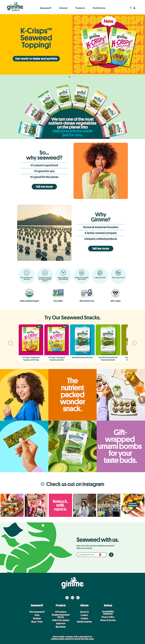
This is a well-balanced and fun homepage. Snack packaging trends are currently bright and exciting, and they did a great job translating that to the website. But they didn't just lean on their food.
The homepage sections tell me three big things: what their products are, why I would eat seaweed (I like it, but I know not everyone does), and who owns it. In all that, I've learned they have a selection of healthy snacks, seaweed is good for me, and this is a family-owned company (I'm the type of person who likes to support those).
They're used to putting things in bite-sized packages, and they successfully did that with their brand and info on their website.
The structure is straightforward but strategic. Each section addresses a potential barrier or opportunity (product variety, health benefits, brand story) without overloading you.
The hierarchy keeps things moving. Bright colors and bold product photography carry the energy from the packaging into the digital experience, which creates consistency across touchpoints.
The hero had me hesitating. Something about the logo in the white background of a large navbar felt off, but I was into it as soon as I started to scroll.
That first impression matters, and the hero didn't quite click right away. Once you get past it, the rest of the site flows well, but smoothing out that initial moment would make the whole experience feel more cohesive from the start.
A restaurant homepage divided into chapters with smooth scrolling that promises an exceptional experience.

A scrollable coffee shop site that communicates vibe and values quickly.

A food truck site that goes above and beyond with personality and clarity.