
Somni
A restaurant homepage divided into chapters with smooth scrolling that promises an exceptional experience.
Food & BeverageHomepage
A food truck site that goes above and beyond with personality and clarity.
May 20, 2026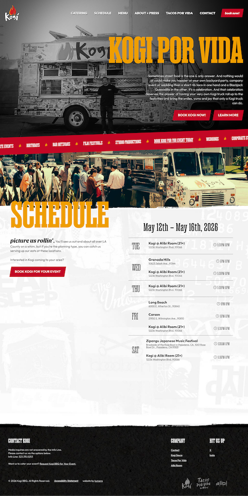
I love food trucks, but most of them have terrible websites (if they even have one). I get it. It's a tough business, and what do they need it for? They usually just focus on social media and making awesome food. This one went above and beyond, though, and I think it was worth it.
To use a cliche term that designers hate, they really made this one pop. This site shows they have a cool and quirky character. The homepage is short and sweet, and all it took was a quick scroll for me to know I like this site (and probably the food, too). I also know I can hunt them down for some delicious munchies, or I can hire them for my event.
The structure is simple and efficient. It's not trying to be a long-form brand story. It's just giving you what you need: personality, location info, and booking options.
The hierarchy is clear, and everything moves fast. There's animation throughout that adds energy and reinforces the brand vibe. It feels alive in a way most restaurant sites don't.
The scrolling seems to be locked to some of the animations, so it moves at a different pace than most sites. It's very minor, but just enough to subconsciously register some frustration.
When scroll behavior feels slightly off from what users expect, it can create friction (even if they don't consciously notice why). A little fine-tuning there would smooth out the experience.
A restaurant homepage divided into chapters with smooth scrolling that promises an exceptional experience.

A scrollable coffee shop site that communicates vibe and values quickly.

A brand-forward coffee site that carries its in-store identity seamlessly into the digital experience.