
Somni
A restaurant homepage divided into chapters with smooth scrolling that promises an exceptional experience.
Food & BeverageHomepage
A scrollable coffee shop site that communicates vibe and values quickly.
May 21, 2026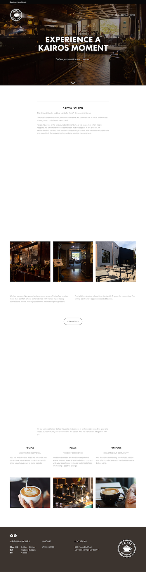
It's very scrollable. A quick scroll and I get their vibe and their values. It's not overfilled with a bunch of text, which means I can actually take it in without feeling overwhelmed.
The layout keeps things moving, and the visuals do most of the talking. It's an efficient way to communicate who they are without asking for too much of my time.
The structure is simple and clean. Each section is focused, and nothing lingers too long. The hierarchy guides you through the story quickly, which works well for a local coffee shop where people just want to know the basics: what's the vibe and where are you.
Photography and minimal text carry the experience. It feels approachable and unpretentious, which fits the brand.
I scrolled through excitedly, and then it just kind of… ended. I wish there was some sort of CTA at the end. Not as a sales tool, but as a guide to help me figure out what to do next.
Even something simple like "Visit Us" or "See the Menu" would give the experience a natural conclusion instead of leaving me wondering if I missed something.
A restaurant homepage divided into chapters with smooth scrolling that promises an exceptional experience.

A food truck site that goes above and beyond with personality and clarity.

A brand-forward coffee site that carries its in-store identity seamlessly into the digital experience.