
Deus ex Machina
An About page that breaks all the rules on purpose, and nails the brand by doing it.
E-commerceAbout Page
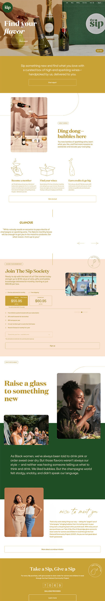
I like that it's elegant in a modern way. It's not overdone. It feels young and hip, while also feeling classy.
I also appreciate the fact that they created a color scheme and stuck to it. To many sites are getting lazy in that area.
Some of the gold text/white background sections are a little challenging to read. But, they still seem to have enough contrast, so I don't think it's a big deal.
An About page that breaks all the rules on purpose, and nails the brand by doing it.

An About page that uses GIFs to create a video-like story without the friction of a play button.

A plant-based meal delivery site that keeps food front and center without overdesigning.