
Deus ex Machina
An About page that breaks all the rules on purpose, and nails the brand by doing it.
E-commerceAbout Page
A plant-based meal delivery site that keeps food front and center without overdesigning.
May 23, 2026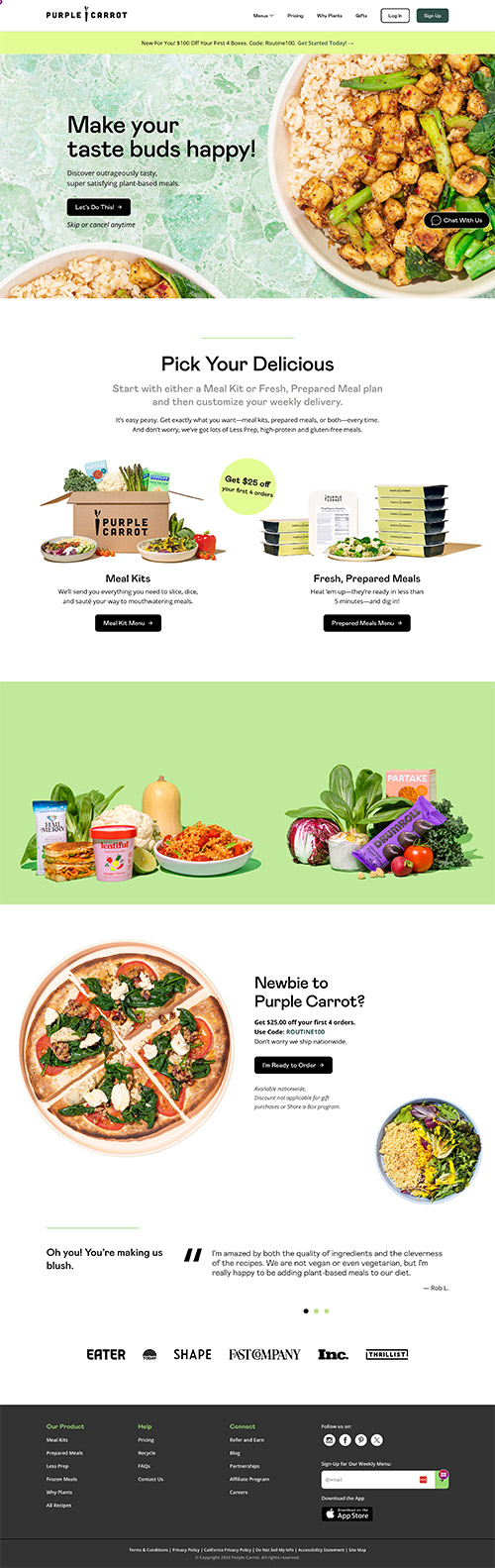
Purple Carrot does a great job of keeping food imagery front and center on the homepage. They don't have a ton of text or aggressive popups to distract me.
I can easily learn about their offerings and options (which look delicious), and the navigation structure is straightforward so I can find whatever else I need.
Overall, this is a great example of not overdesigning your site. It's attractive and easy to use, so it gives me a good experience from the start.
The structure is clean and purposeful. Food photography leads every section, which makes sense because that's what you're buying. Text is there to support, not dominate.
Navigation is simple and predictable. There's no hunting around for basic information, and nothing feels hidden or overcomplicated. The hierarchy keeps you focused on the product without unnecessary friction.
I like the Purple Carrot logo. I wish that was somehow mixed in more with the web design, the way it is on the packaging.
The packaging has a distinct visual identity that feels connected to the brand name and logo. The site doesn't quite carry that through as strongly, which is a missed opportunity for brand cohesion across touchpoints.
An About page that breaks all the rules on purpose, and nails the brand by doing it.

An About page that uses GIFs to create a video-like story without the friction of a play button.

A luggage brand that's unapologetically wild, and commits to it fully.