
Deus ex Machina
An About page that breaks all the rules on purpose, and nails the brand by doing it.
E-commerceAbout Page
A luggage brand that's unapologetically wild, and commits to it fully.
May 18, 2026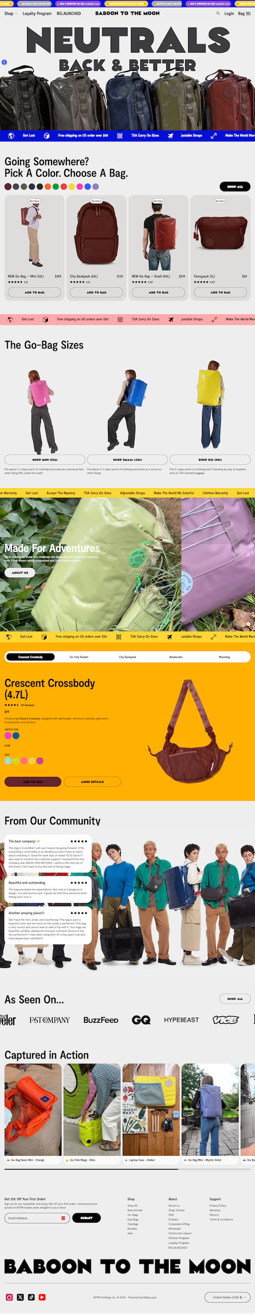
I'm going to come right out and say it: this site isn't my style.
But that's kind of the point. Their name is Baboon To The Moon, after all. Before I even opened it, I knew the site wouldn't disappoint. They were going to be unapologetically who they are.
And they are. It's wild. All of it is wild. The colors. The photos. The fonts. The bright scrolling elements. The videos practically flying out of the screen.
It feels like a baboon made this site (I mean that as a compliment). I've barely looked at any of it, and I can already totally understand their brand.
The structure is designed to overwhelm you in the best way. Everything is loud and energetic, which matches the brand personality perfectly. There's motion everywhere, bright colors at every turn, and a pace that doesn't let you settle.
It's not trying to be subtle or refined. It's trying to make an impression fast, and it does. The hierarchy is less about guiding you gently and more about throwing everything at you at once. And somehow, it works.
The whole sensory overload thing is likely to scare some people away. That's probably a risk this brand should take (they likely get more attention from being wild than they'd lose from being too much). But, it's always worth thinking about. If you commit this hard to one aesthetic, you're definitely narrowing your audience. In this case, it feels intentional. Just make sure that tradeoff is one you're willing to make.
An About page that breaks all the rules on purpose, and nails the brand by doing it.

An About page that uses GIFs to create a video-like story without the friction of a play button.

A plant-based meal delivery site that keeps food front and center without overdesigning.