
DataDome
A SaaS site that feels like a polished pitch deck (narrative, balanced, and thoughtfully designed).
SaaSHomepage
A clean, no-hype SaaS gallery that proves timeless design and usability still win.
May 7, 2026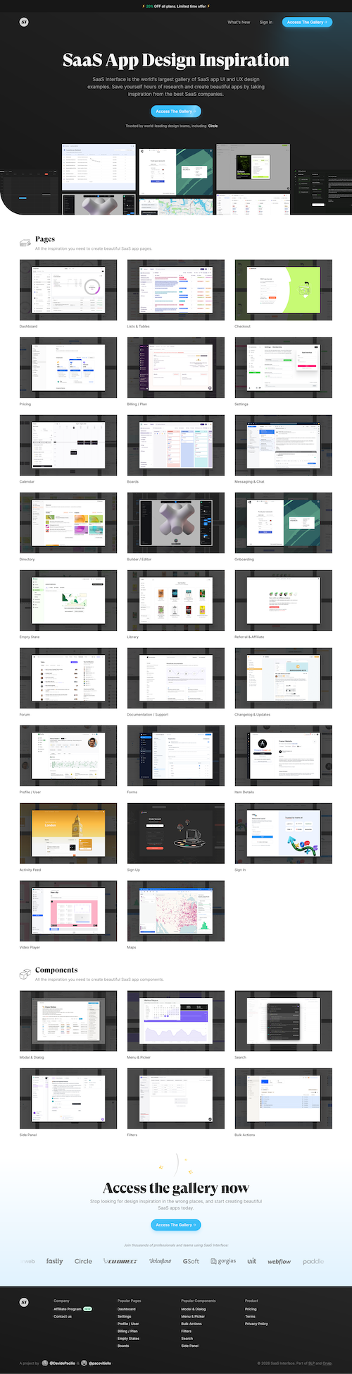
This site is a nice break from the current trend of "look how much AI we can cram into one homepage." It doesn't try to reinvent anything. It just executes really well on a proven pattern. Isn't that kind of refreshing?
It feels like something that would've looked good a year ago and will still look good a year from now. That kind of restraint is underrated, especially in a space where everyone's chasing the next flashy thing.
The structure is straightforward in the best way. You land, you understand what it is, and you can immediately start exploring. The hierarchy is clear, and the content (the actual interfaces) gets to be the star.
There's a nice rhythm to how content is revealed. Enough to draw you in without overwhelming you. It feels designed for scanning and browsing, which fits the use case perfectly.
The hero CTA says "Access The Gallery," which sets a pretty clear expectation… and then it drops you on a pricing page. Not the end of the world, but it's a slightly awkward first interaction.
Everything else does a solid job of previewing content before gating it, so this stands out more than it should. A small tweak to either the label or the flow would make that first click feel a lot more aligned.
