
Opal Security
A cybersecurity SaaS site that balances clarity, trust, and modern design without falling into cliché.
SaaSHomepage
A SaaS site that feels like a polished pitch deck (narrative, balanced, and thoughtfully designed).
May 17, 2026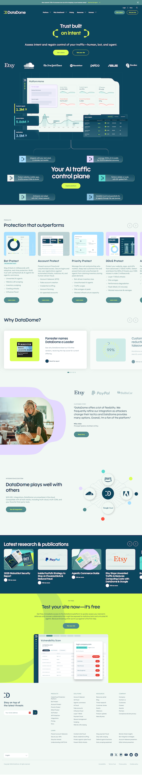
Websites are often an afterthought. But just like a brochure, they shouldn't be overlooked. After all, they might be the first point of contact someone has with a company! This one just has that feeling that they cared. And if they care about me from the start, I feel more confident as a customer.
It feels like I'm reading a pitch deck or watching a demo (in a good way). The colors, layouts, everything. It all feels very narrative and balanced. There's a clear story being told, and each section builds on the last without feeling repetitive or rushed.
The structure is clean and intentional. It moves through the value prop, features, and benefits in a way that feels natural, not forced. The pacing is deliberate, and the hierarchy keeps you focused on what matters at each step.
The color system adds personality without distracting from the content. Everything feels cohesive and professional, which reinforces trust, which is especially important for a security-focused product.
I'm very picky about hero sections, and this one is too busy. There's a social proof logo section above the fold that clutters the initial experience.
If they moved those logos below the fold, I'd have an entirely different first impression. The hero would feel cleaner, more focused, and more confident. Right now, I think it's trying to do a little too much at once.
