
DataDome
A SaaS site that feels like a polished pitch deck (narrative, balanced, and thoughtfully designed).
SaaSHomepage
A cybersecurity SaaS site that balances clarity, trust, and modern design without falling into cliché.
May 8, 2026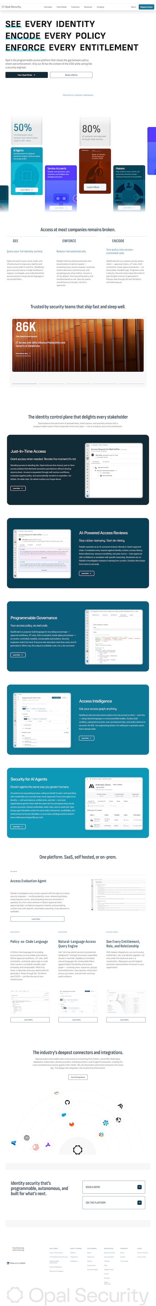
Cybersecurity sites tend to go one of two ways: either they completely ignore design, or they look like they're pitching the next sci-fi blockbuster. This sits right in the middle (in a good way).
It feels professional, modern, and actually thought through. Nothing is trying too hard, but nothing feels neglected either. That balance is hard to hit, especially in a space where trust matters this much.
The hero is about as clean as it gets. A bold headline paired with three simple promises makes it immediately clear what the product does and why it matters. No decoding required.
From there, the site keeps a steady rhythm. There's enough animation to make things feel alive, but it never crosses into "look what we can do with motion" territory. Visuals are used strategically to add color and context, while the overall palette stays grounded and trustworthy.
The hierarchy does a lot of work here. Each section builds on the last without overwhelming you.
Some sections feel a bit cramped, especially on a laptop-sized screen. Elements are scaled up in a way that reduces breathing room, which makes the layout feel tighter than it needs to be.
It's not a structural issue. It's more of a spacing and proportion tweak. Giving sections a little more room to breathe would make the whole experience feel more polished and easier to scan.
