
Loyal Coffee
A brand-forward coffee site that carries its in-store identity seamlessly into the digital experience.
Soft product color, easy spacing, and just enough premium energy without becoming overly polished.
August 9, 2024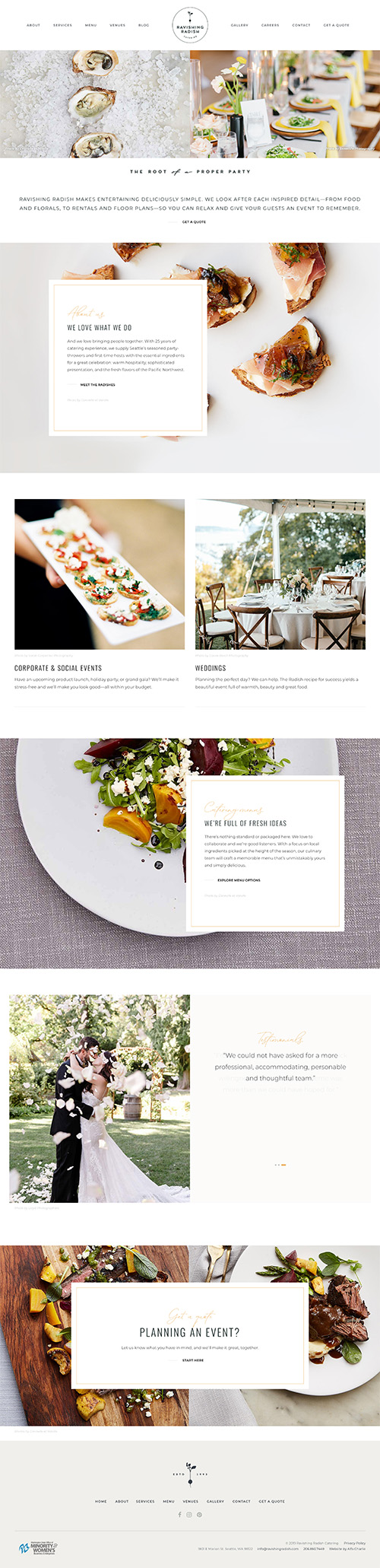
Well, I love the name!
But, on to the design, I love the elegance. If I’m going to be hosting a luxurious party, I want to be confident that the caterer will uphold the standards I’m hoping for. And sadly, many catering websites seem like an afterthought to those companies.
But Ravishing Radish really puts their best food… er… foot forward with this design. I’d trust them with my fancy party.
Some of the headings use typefaces that aren’t the easiest to read. In a world of lazy internet users, I recommend avoiding that.
A brand-forward coffee site that carries its in-store identity seamlessly into the digital experience.

A moody, neon-accented restaurant site that nails first impressions but plays it safe below the fold.