
Hop Alley
A moody, neon-accented restaurant site that nails first impressions but plays it safe below the fold.
A brand-forward coffee site that carries its in-store identity seamlessly into the digital experience.
May 6, 2026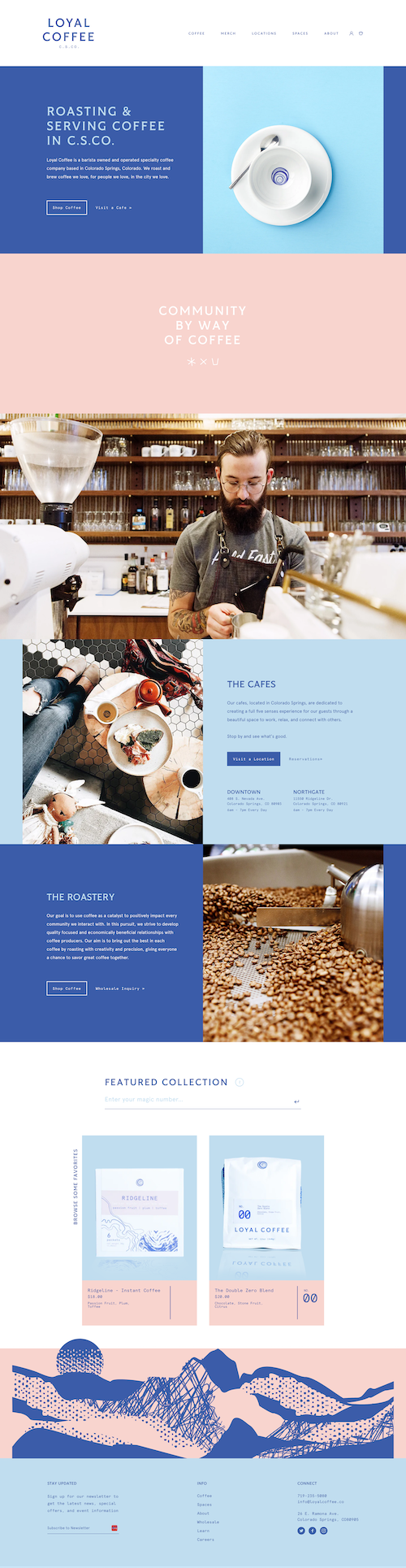
This is one of those rare cases where the website actually lives up to the physical brand. A lot of coffee shops (and unfortunately, a lot of restaurants in general) put all their energy into the in-person experience and treat the website like an afterthought. Not here.
Everything feels intentional. The design reflects the same personality you’d expect walking into the space. And that's somethign which immediately builds trust. It signals that if they care this much about the digital side, they probably care about everything else too.
The layout leans into clarity while still letting the brand shine. There’s a nice balance between structure and personality. Nothing feels overdesigned, but it definitely doesn’t feel generic either.
Navigation is straightforward, and content is organized in a way that makes sense for someone deciding whether to visit. The hierarchy supports exploration without overwhelming you, which is exactly what you want for a local spot with a strong identity.
The “Spaces” link in the main navigation jumps to a subdomain, which isn’t inherently a bad thing. The problem is that it does break the flow a bit. It took a second to reorient and figure out how to get back, which is just enough friction to notice.
A little more continuity between the main site and that subdomain (or a clearer return path) would smooth that out and keep the experience feeling cohesive.
A moody, neon-accented restaurant site that nails first impressions but plays it safe below the fold.

Soft product color, easy spacing, and just enough premium energy without becoming overly polished.