
Loyal Coffee
A brand-forward coffee site that carries its in-store identity seamlessly into the digital experience.
A moody, neon-accented restaurant site that nails first impressions but plays it safe below the fold.
May 5, 2026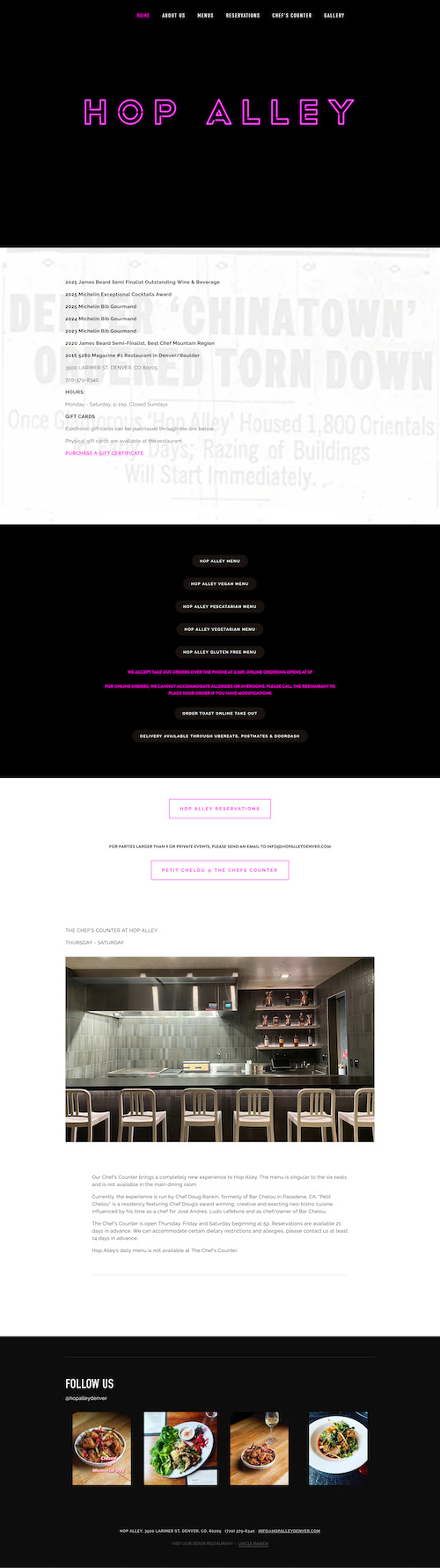
This is a restaurant site that immediately feels like the place itself—dark, a little exclusive, and very intentional. The black header with that neon-style branding does a ton of heavy lifting right out of the gate. Before I’ve even scrolled, I already get the vibe.
After that, it shifts into a more straightforward, practical experience. It loads fast, it’s easy to navigate, and I can get to menus or reservations without thinking.
The hierarchy is doing its job, especially up top. That header creates a strong visual anchor, and everything else falls into a predictable, usable flow. Navigation is clear, spacing is clean, and nothing really gets in your way.
That said, the pacing drops off pretty quickly after the hero. The contrast between the bold, neon-driven intro and the rest of the site is noticeable. It almost feels like two different energy levels:
It’s kind of a missed opportunity not to carry that neon, moody aesthetic further down the page. The header sets a strong tone, and then the rest of the site doesn’t quite follow through.
The good news is this is mostly a visual continuity issue, and that's easy to fix. Extending that same design language (color accents, lighting effects, or even subtle motion) throughout would make the whole experience feel more cohesive and memorable.
A brand-forward coffee site that carries its in-store identity seamlessly into the digital experience.

Soft product color, easy spacing, and just enough premium energy without becoming overly polished.