
Deus ex Machina
An About page that breaks all the rules on purpose, and nails the brand by doing it.
E-commerceAbout Page
A standard sock site with one standout detail, a ransom note-style newsletter signup.
April 4, 2024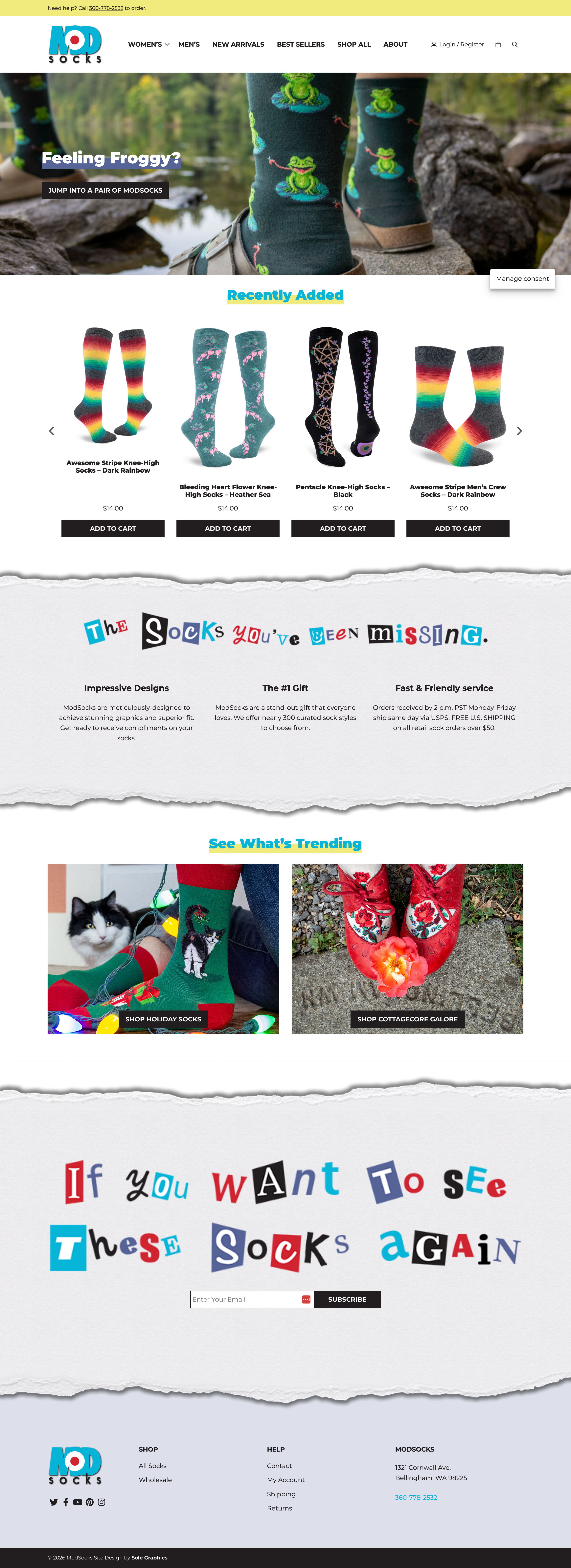
The Mod Socks site is pretty standard… until it isn't.
Scroll down and look at the newsletter signup section. It's like an old ransom note. Cut-out letters, mismatched fonts, the whole thing. This is just a perfect example of how the devil is in the details, and something clever can really make your brand stand out.
Most of the site follows a pretty typical eCommerce structure. Navigation is clear, products are easy to browse, nothing gets in the way. It does what it needs to do.
But then you hit that newsletter section, and it completely shifts the tone. It's playful, unexpected, and memorable in a way the rest of the site isn't. That one detail does more for the brand than a dozen polished product grids.
The rest of the site is fine, but nothing extraordinary. The logo especially could use some work, it doesn't quite match the creativity shown in that newsletter section.
There's definitely room for improvement across the board, but the good news is they already have a really cool anchor to build around. If they brought that same energy to the rest of the brand, this could be something special.
An About page that breaks all the rules on purpose, and nails the brand by doing it.

An About page that uses GIFs to create a video-like story without the friction of a play button.

A plant-based meal delivery site that keeps food front and center without overdesigning.