
Deus ex Machina
An About page that breaks all the rules on purpose, and nails the brand by doing it.
E-commerceAbout Page
A straightforward bike eCommerce site that proves doing the basics well is your best strategy.
May 10, 2026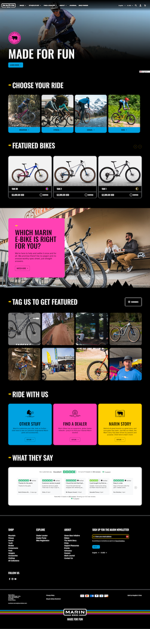
This is a reminder that you don't need to reinvent anything if you just execute well on the basics. There's nothing groundbreaking here, it's a grid-based eCommerce site with good photos and clear hierarchy. And that's exactly why it works.
The black background could feel heavy, but because most of the product shots are bright and high-energy, the whole thing stays lively. It leans on simple text and action photography to communicate quickly, which fits the product perfectly.
The grid does what a grid is supposed to do: keep everything aligned and easy to scan. There's a clear structure that carries through the whole site, which makes navigating feel predictable in a good way.
What really stands out is the color system. They've got blue, yellow, and pink threaded throughout (these come from their visual design, and were carried over to the site). They're sprinkingled throught the CTAs and other sections, and it's just enough variation to keep things visually interesting without feeling chaotic. That's a small detail that adds a lot.
The hero has a bold tagline ("Made for Fun") and a button. But then… what? A subheading would go a long way here. Even just a short line to clarify what I'm looking at or what makes this different would make the intro feel more complete.
And the sidebar email popup is way too aggressive. It pulls focus at exactly the wrong moment and feels like it's fighting the rest of the site's calm, confident vibe. A lighter touch there would make a big difference.
An About page that breaks all the rules on purpose, and nails the brand by doing it.

An About page that uses GIFs to create a video-like story without the friction of a play button.

A plant-based meal delivery site that keeps food front and center without overdesigning.