
Deus ex Machina
An About page that breaks all the rules on purpose, and nails the brand by doing it.
E-commerceAbout Page
A rebellious streetwear brand that strips eCommerce down to pure product, and pulls it off.
May 27, 2026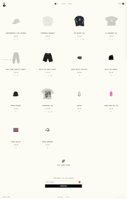
A rebellious and trendy streetwear brand can't sell out and have a normal website. That's a law. They went so obscure that they did something I've never seen before, and I actually think it's a great lesson for eCommerce sites, even those that are more mainstream (a.k.a. lame).
The homepage has a grid of a bunch of products, with just image, name, price, and sizes (or "sold out," you know, scarcity and all that). The fun part is that's almost all that's on the homepage. The top nav just has (very small size) the logo, some view filters, and a shopping cart. The bottom has a link to play a game, a newsletter signup, and a few links.
I talk a lot about how I like minimal design, but this brand takes it literally. This is the website equivalent of a restaurant that doesn't have a sign outside. If you have to ask, you're not cool enough.
The structure is ruthlessly simple. It's just products. No hero image, no brand story, no long descriptions. Just a grid of what you can buy.
I really like cutting straight to the chase and showing the products. If I want to buy, I can buy. There isn't a ton of noise (random photos, long descriptions, annoying popups, etc.) to get in my way.
The hierarchy is almost non-existent by design. Everything is equal, which forces you to engage with the actual products instead of being guided by marketing.
Just remember that very few brands can pull this off. This works because Greedy Unit has the brand equity, the audience, and the product to make it work.
But never forget that all "rules" have an exception, so don't be afraid to break them when you can get away with it. Just make sure you actually can.
An About page that breaks all the rules on purpose, and nails the brand by doing it.

An About page that uses GIFs to create a video-like story without the friction of a play button.

A plant-based meal delivery site that keeps food front and center without overdesigning.