
Deus ex Machina
An About page that breaks all the rules on purpose, and nails the brand by doing it.
E-commerceAbout Page
A running brand site that wins by doing the basics right while competitors overdid it.
May 15, 2026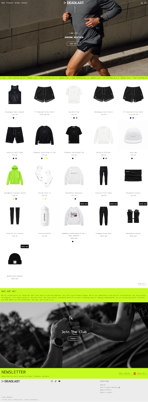
This site stood out to me because it just worked. I was checking out a few different running brand sites, and most of them were really cool, but they had a big problem. They were so overdone that they were slow to load and hard to navigate.
This one kept it simple and fast. The hero shows a runner with very clean, minimal navigation. Nothing gets in the way.
They use a bright green section to separate parts of the site, which is a nice little divider that adds personality without overcomplicating things.
The product grid on the homepage does exactly what it should. Each product is primarily the image, with minimal text (just name, price, tec.). That's smart visual hierarchy. The products get to speak for themselves.
On hover, you get an alternate photo, which is a nice touch that makes the whole thing feel a little more alive without slowing anything down.
The structure is straightforward and predictable, which in this context is exactly what you want.
It's a little lacking in character. If I hadn't just had a frustrating experience with a few competitor sites, this probably wouldn't have stood out as much.
That said, this is actually a really interesting case study in paying attention to what else your customers are experiencing. Sometimes the best move isn't to be the flashiest. It's to be the one that actually works when others don't.
An About page that breaks all the rules on purpose, and nails the brand by doing it.

An About page that uses GIFs to create a video-like story without the friction of a play button.

A plant-based meal delivery site that keeps food front and center without overdesigning.