
Ataraxis
A tech site that nails modern and futuristic without overdoing it or feeling tacky.
TechnologyHomepage
A calm, editorial-style tech site that makes complex work feel clear, readable, and human.
May 9, 2026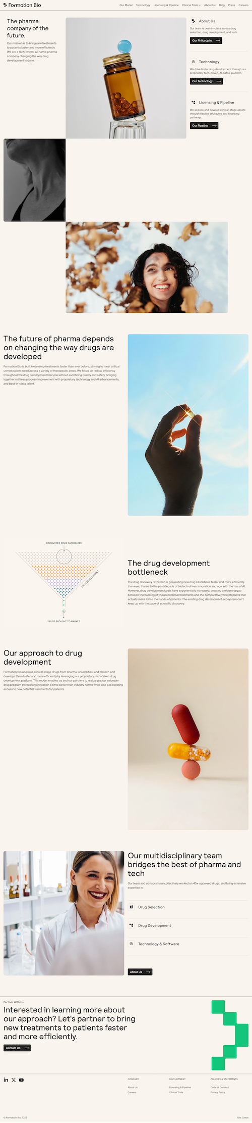
This site just feels good to be on. It's clean, modern, and somehow manages to feel a little comforting, which is not something you often hear about tech sites.
It leans into an editorial style that feels inspired by old magazines or newspapers, but not in a way that makes it feel dated. That balance makes the content easier to read and a lot more approachable, especially for something that could easily feel complex or clinical.
The layout is where this really shines. It shifts as you scroll (different structures, different arrangements) but still feels consistent the whole way through. That's not easy to pull off.
Typography and spacing do most of the work, supported by simple but bold photography. Animations are light and mostly live in transitions, which keeps things feeling smooth without drawing too much attention.
The hero is especially interesting. That right-side sidebar adds something a little unexpected, but it still feels intuitive. It gives the page a unique entry point without making you think too hard.
There's no persistent navigation as you scroll, which means if I want to jump somewhere else, I have to head back up to the top.
To be fair, a sticky menu might take away from the clean, editorial feel a bit. But there's probably a middle ground. Something lightweight that keeps navigation accessible without interrupting the aesthetic.