thirteen23
A calm, confident agency site that feels like the future without chasing AI trends.
May 14, 2026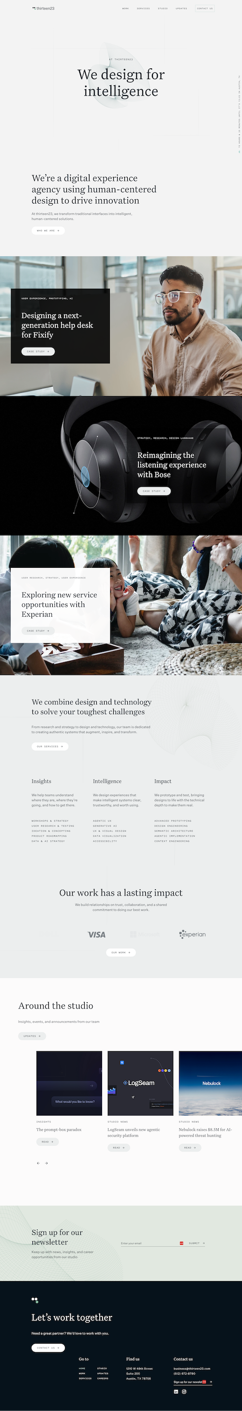
Why I Like This Site
This site just feels clean. It's what I imagine the future to be (like Apple meets tomorrow). In a sea of flashy "AI-style" sites trying way too hard, this is the complete opposite.
It makes me feel warm and happy, which is not something I say about agency sites often. There's a smooth animation behind the hero (a seashell-like shape) but the slow movement sets a tone of calm and steady, not flashy and desperate.
Layout and Flow
There's no CTA in the hero, which is an awesome show of what they think of their level of quality. As you scroll, you mostly see case studies and work. No aggressive sell. No popup trying to get you on a call.
On a lot of sites, that would feel like a liability. Here, it shows confidence. They know you're going to be impressed, and they're confident they'll attract the right clients. You konw, the ones that are a good fit for both sides.
The pacing is deliberate. Nothing rushes you. The motion adds just enough life to keep things interesting without competing for attention.
What I'd Steal From This
- Leading with slow, intentional motion that sets tone instead of trying to impress.
- Skipping the hero CTA when your work is strong enough to speak for itself.
- Using confidence (not urgency) as a positioning strategy.
- Keeping the overall aesthetic minimal and future-forward without chasing trends.
What I'm Not Crazy About
Some of the case study photos on the homepage feel a bit like stock images. They don't quite match the rest of the site's visual identity.
I'd love to see more abstract shapes (like the one in the hero) used throughout, tied to each section. That would create a more uniform identity and reinforce the clean, futuristic vibe they've already nailed.