
Whitney Museum of American Art
Trendy and modern, but the design elements are minimal enough that it highlights their exhibits.
Cultural InstitutionHomepage
An Austrian hotel site that feels like an art gallery & portfolio, while still keeping booking front and center.
May 11, 2026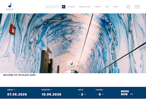
I once stayed in this hotel, and it actually feels like an art gallery with rooms. I'm very happy that the site nails that same vibe. It looks like the portfolio of an elegant designer, but still manages to keep hotel info and the booking experience right where you need them.
The white background paired with vivid photography and bold, dark headings gives it an exclusive, artsy feel (in the good way). It doesn't try to be flashy or trendy. It just commits to a clear visual identity and follows through.
The hero is wordless. It's just a strong photo that does all the talking (you know, 1,000 words and all that). Right below it is a booking button that actually looks thoughtfully designed, not like they dropped in the default calendar widget and called it done.
From there, it walks through the story of the place, the rooms, and the experience. All in a way that feels closer to a creative portfolio than a corporate hotel site. That's a smart move. It reinforces the brand while still giving you everything you need to make a decision.
The hierarchy is clean and confident. Nothing clutters the layout, and each section gets room to breathe.
The mobile version isn't quite as polished. There's even a heading that gets cut off (in the English version, it may be different on the German page), which feels a little off-brand for something this refined.
For a designer portfolio, I'd let it slide. But for a hotel where a lot of people are booking on their phone while traveling, that's a bigger deal. A little more attention to mobile would bring the experience up to the same level across devices.